Promptis Brand Identity
Background
Promptis builds the foundation of the AI economy, providing scalable infrastructure that empowers developers and enterprises to deploy intelligence everywhere. Operating at the cutting edge of AI SYS25 and NX1.0 technologies, the platform allows companies to scale seamlessly across global networks with high performance precision.
Promptis builds the foundation of the AI economy, providing scalable infrastructure that empowers developers and enterprises to deploy intelligence everywhere. Operating at the cutting edge of AI SYS25 and NX1.0 technologies, the platform allows companies to scale seamlessly across global networks with high performance precision.

Thinking
The idea behind Promptis is built around a simple but powerful concept: a continuous loop of intelligence and connection. As a platform designed to support the growing AI economy, it needed to feel both solid and dependable, while still flexible enough to scale globally.
The idea behind Promptis is built around a simple but powerful concept: a continuous loop of intelligence and connection. As a platform designed to support the growing AI economy, it needed to feel both solid and dependable, while still flexible enough to scale globally.
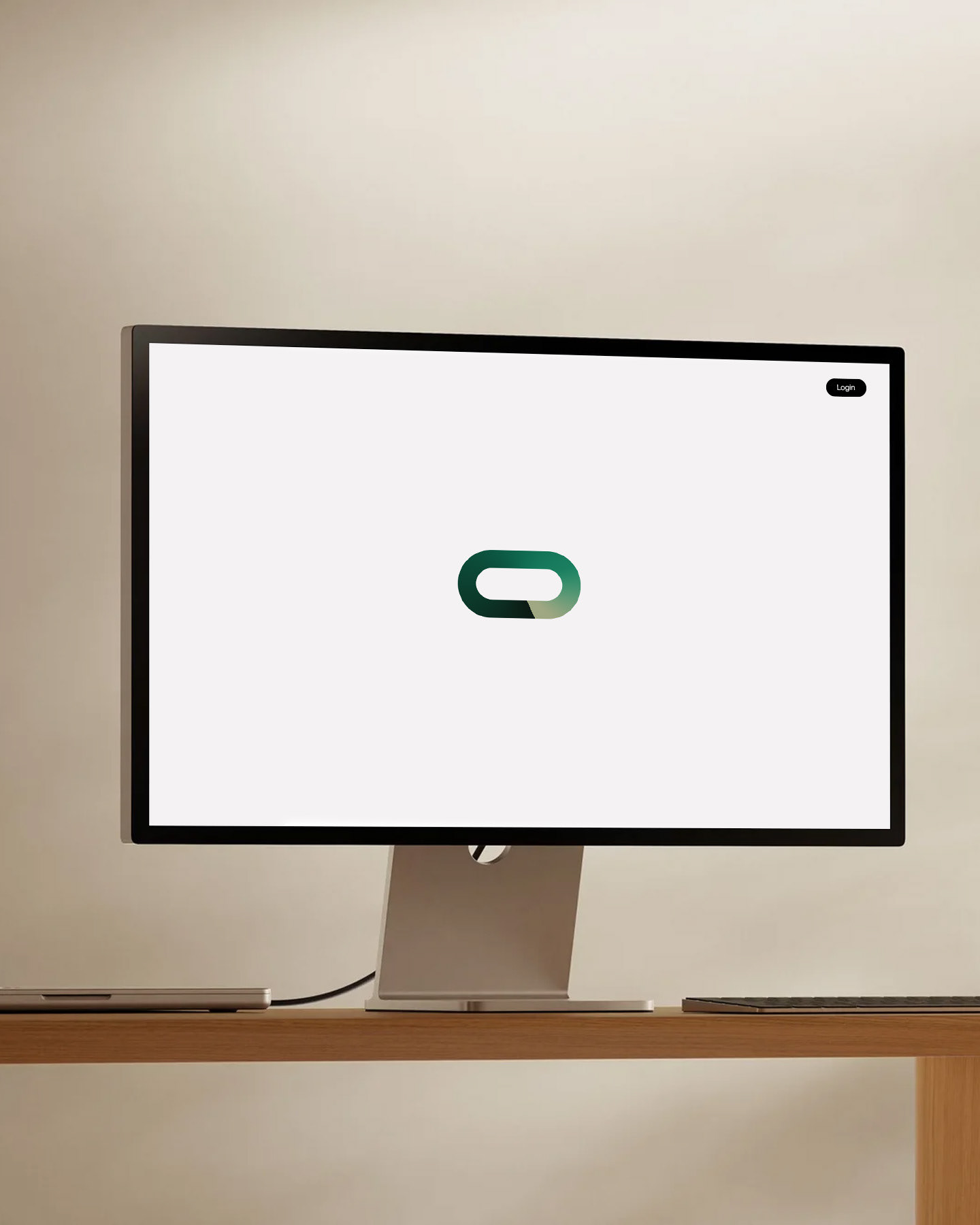
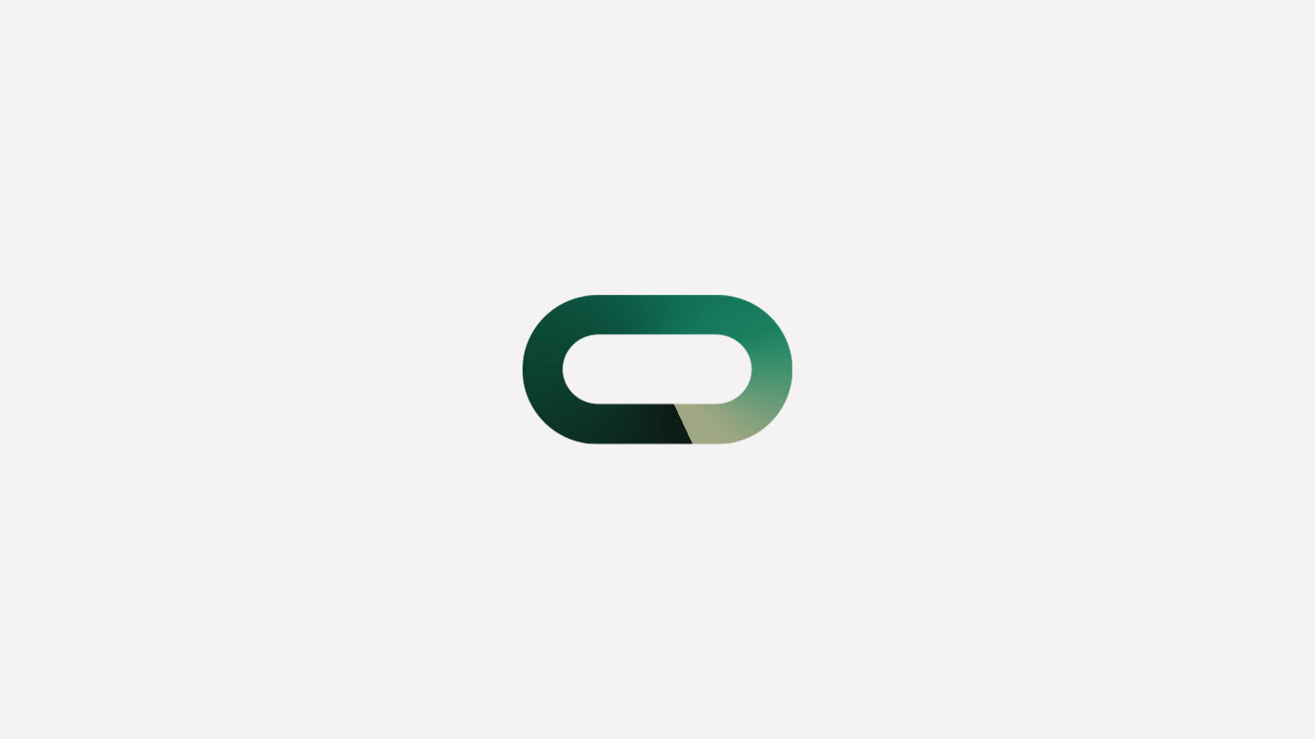
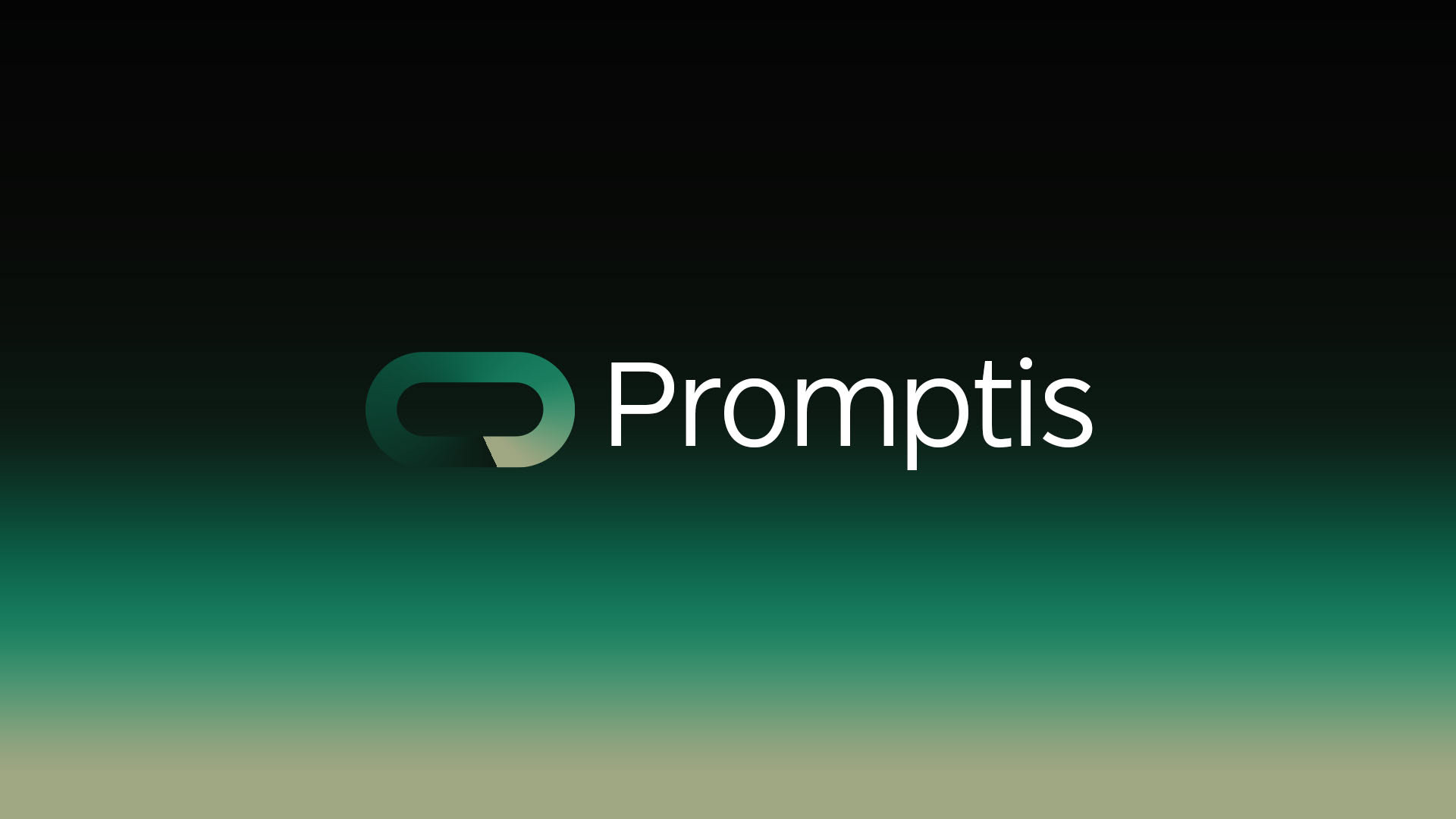
Instead of relying on typical high-tech visuals, we focused on something that connects complex AI systems like SYS25/NX1.0 to real world use. The central capsule symbol reflects this idea, representing a secure and continuous flow. At the same time, the gradient transitions capture the shift from raw data to high-performing intelligence moving across global networks

Outcome
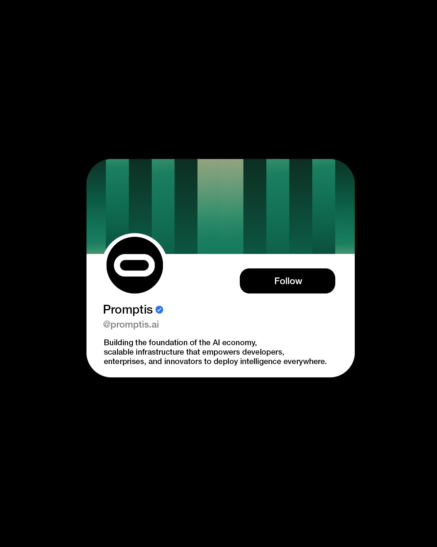
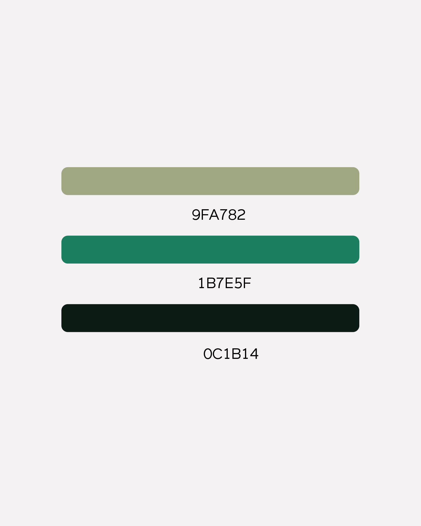
The final identity is clean, confident, and designed to position Promptis as a serious player in the AI space. It combines a deep, forest inspired color palette with soft sage accents, moving away from the usual neon-blue tech look in favor of something more grounded and globally relevant.
The final identity is clean, confident, and designed to position Promptis as a serious player in the AI space. It combines a deep, forest inspired color palette with soft sage accents, moving away from the usual neon-blue tech look in favor of something more grounded and globally relevant.
The typography is simple and modern, making it easy to read for both developers and enterprise users. Subtle vertical, architectural patterns add flexibility, giving the brand a consistent visual language across both digital and physical applications. The result is a cohesive identity that feels both modern and enduring, reflecting a brand built for growth and long term impact
.